Urban Yoga Spa
The challenge
Urban Yoga Spa knew their website needed a facelift. They wanted a fresh, new website design and reorganized/consolidated site structure, with a bottom line of SELL SELL SELL. They also wanted a site that drew attention to all of what they offered (yoga studio, spa, coffee shop and event space).
Our SOlution
Because of the time frame (a little under three weeks), we decided to focus on the three most impactful goals: a reorganized site structure, an update of the yoga part of the site (yoga being responsible for approximately 90% of current business), and an updated, modern visual design. We created a prototype that addressed the needs of the customers while fulfilling the goals of the client.
My Role
My team consisted of three people including myself. During the research process, I was in charge of user interviews, persona creation, initial website user testing and prototype usability testing, and was involved directly with sketching, design labs, affinity mapping and some feedback on the visual design. The small size of our team, and the relatively brief duration of the project (3 weeks) meant that all three team members were involved in most aspects of the entire process.

User Interviews
After disseminating a screener survey, I selected 8 subjects to interview regarding their fitness studio going habits, with the hope of understanding what users were looking for when searching for a fitness class online. Based on the interviews, we learned type of information users wanted after visiting a studios' website, and what they were looking for at the studio itself:
- What to expect at the studio
- Clear, accessible information on the classes offered
- Knowledgeable, experienced instructors
- Importance of community
- Time is the most important factor when deciding on a class
- Schedule should be easy to locate, easy to use
Initial Site Usability Testing

I brought 5 potential users through a script we designed to try and hit all the areas the client wished for the redesign to address, as well . Based on the feedback, I identified some problem areas.
- Home screen was too busy
- Difficulty finding the 'About Us' section
- Difficulty navigating schedule
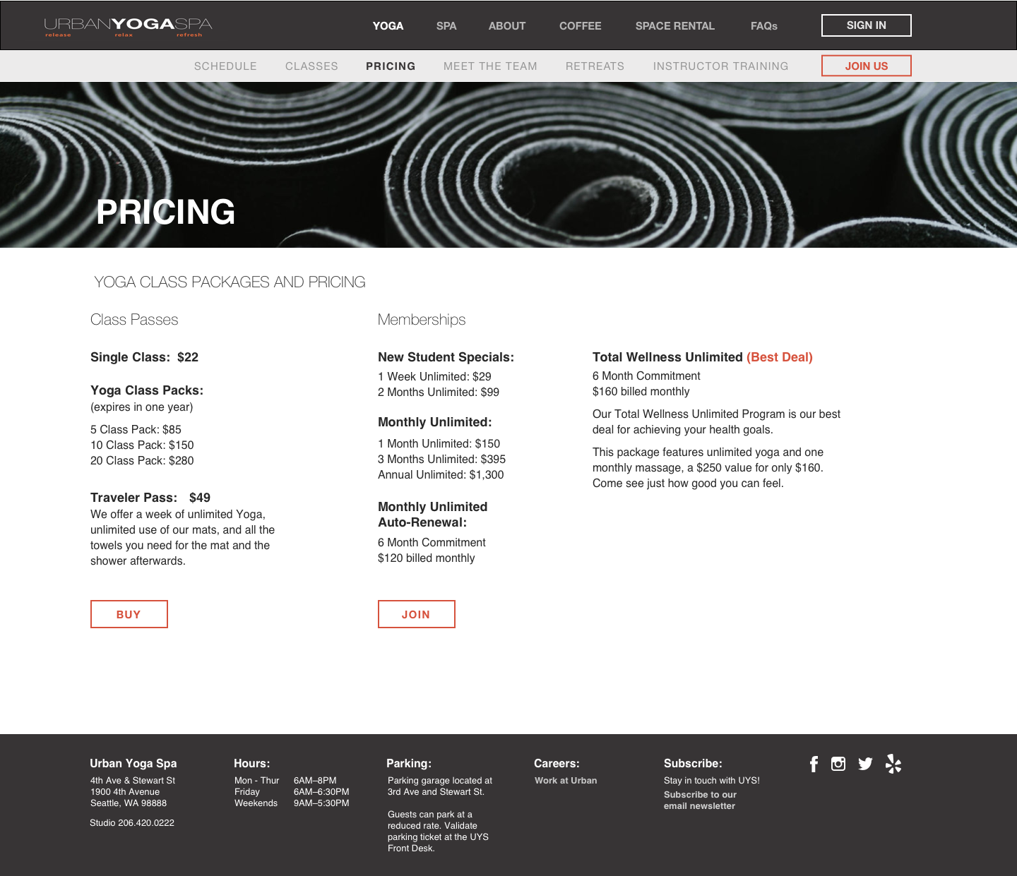
- Clearer, more accessible pricing and purchase options
- Menus too cluttered
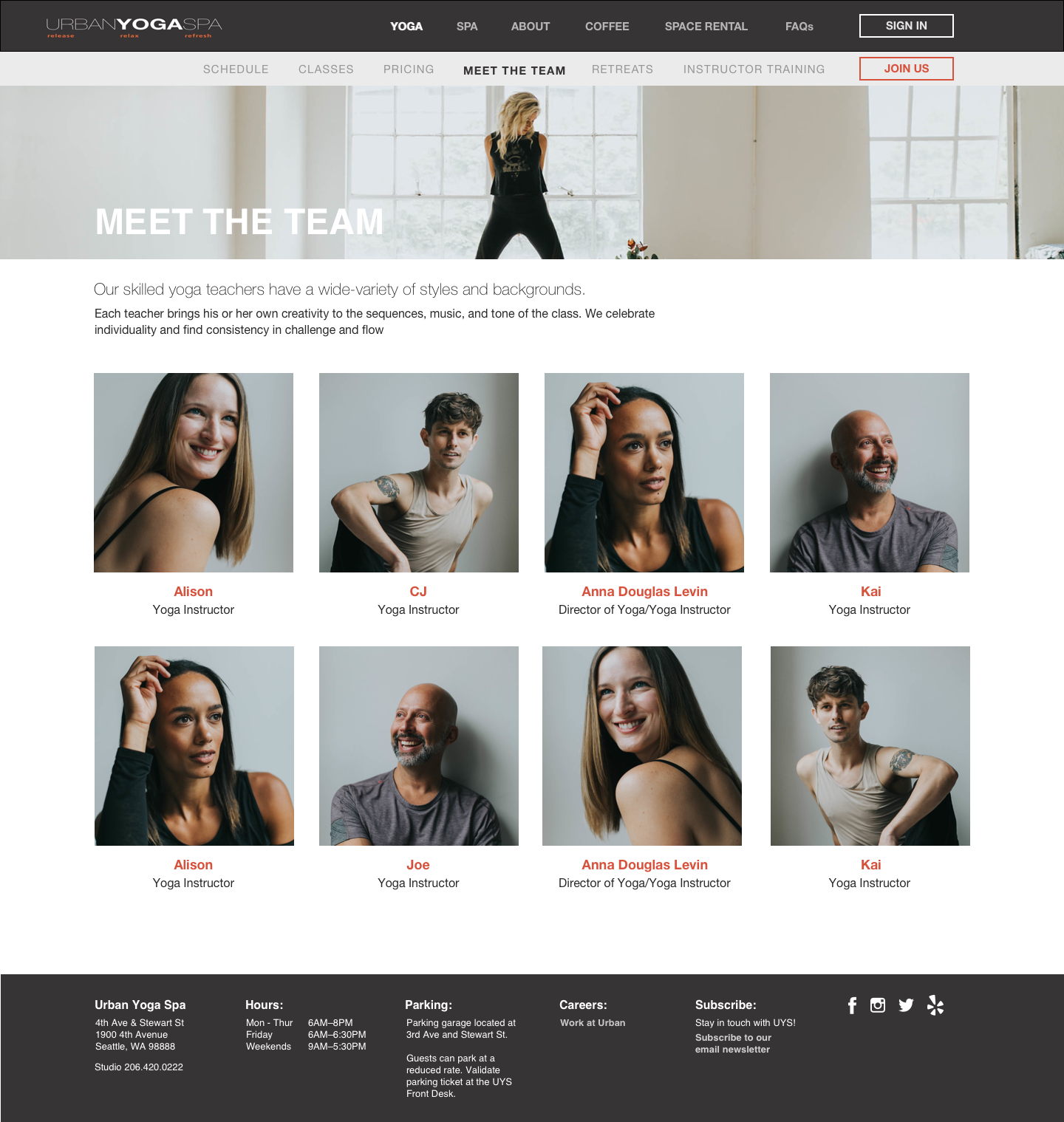
- Not enough pictures
Persona
We used the information gleaned from both speaking with Urban Yoga Spa, who gave us general information on their client base, and our own research to create a persona.

Angela
- 31 Years old
- Single, Engaged to be married
- Financial Analyst
- Works downtown, lives in West Seattle
Affinity Mapping
We used an affinity diagram to tease out the most important themes from the data gathered in interviews and user testing of the current site.

Themes
“I don’t like the visual design.”
“I tend to sign up for membership plans.”
“I’m confused by the layout. I can’t find what I need.”
“I need to know more about Urban Yoga Spa before deciding to join. What can I expect from Urban Yoga Spa?”
“I need more pictures.”
“I need to feel a sense of community.”
“I like to plan ahead… But not too far ahead.”
“I like to know about my instructors.”
“I feel that the pricing is inconsistent.”
Goals and Needs
Based on the clients goals and the feedback from the user interviews and the affinity mapping, we focused our design efforts to try and make it easier for potential and existing clients to:
- Access key information: class schedules, pricing, class descriptions, information about instructors
- Get a sense of UYS and what to expect there
- Buy class passes and memberships
We also spoke to Urban Yoga Spa about their design goals and needs, what types of brands inspired them, and if there were any websites or aesthetics that they were looking to identify with in the redesign. Two websites, Equinox and Tesla were mentioned as brands that UYS felt a connection with. The sleek design, minimalist homepage and overall feelings of luxury were in line with what UYS wanted in the redesign.


Design Studio
To begin the design process, we held a design studio. We focused on the home page with the scenario of a new potential customer coming to the site trying to get a sense of Urban Yoga Spa, keeping in mind the clients' appreciation of the simple yet effective design found on the Equinox and Tesla homepages.
OUR GOALS WERE
- Give a sense of Urban Yoga Spa and what to expect
- Build awareness of the spa
- Simplify the content
TO MEET THESE GOALS WE FOCUSED ON
- More opportunities for photos to tell the story of Urban Yoga Spa on every page
- Less clutter, more cohesive content, removing unnecessary duplicate information
- Easily accessible information about the spa, coffee shop and retail
- More prominent call to action buttons


Usability Testing
Claudia created an interactive prototype so we could test the bones of our initial redesign with potential users. We modified the original website testing script to accommodate the new features of our redesign, but tried to keep the order of actions performed and the user flows as close to the original script as possible.
Testing Results and Iterations
All 8 participants were able to find all of the information they were asked to with a lot fewer clicks than when they were testing on the existing site. Despite the relative ease with which users navigated the new site, there were three common areas for improvement echoed by almost all testers.
CALL TO ACTION
Testing participants wanted a simpler, more visible way to purchase classes
- Added a JOIN button to the secondary navigation
PICTURES
Testing participants wanted more pictures
- Added larger pictures to the bottom of the home page
- Added more pictures to the Yoga and About Us pages
HEAT ICONS
Testing participants wanted clarity on the heat level of each class offered
- Refined heat icons and added heat level of the classes to the title at the top

Final Iteration
Taking into account the user feedback from all parts of the design (and redesign) process, our final design by our talented Visual Designer Monique Boediono